
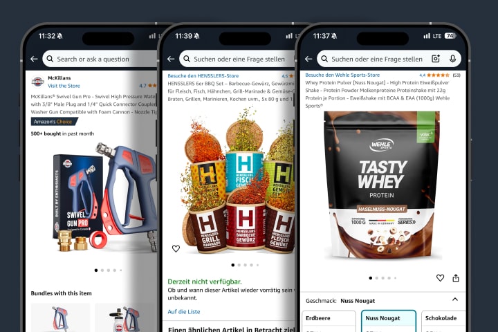
The first product image is the holy grail of your Amazon presence.
It decides in milliseconds whether your listing gets clicked or disappears in the feed.
In this guide, you will learn how to design your Amazon hero image so it stands out, converts, and sets you apart from the competition. As an Amazon agency specializing in design, PPC, and brand building, we apply these strategies systematically for our clients.
Why the Hero Image Is Your Most Important Conversion Lever
Amazon is not a branding channel. It is a marketplace, and what counts there is attention per pixel.
Your hero image is the first thing potential buyers see in search results. And the last thing standing between you and a click.
An optimized hero image means higher click-through rate (CTR), lower ad costs (PPC), better organic rankings, and more revenue at the same traffic level.
1. Maximize the Format, but With Intent
Amazon allows an image area of 1600 x 1600 px. Use this space fully, but without cropping your product. Avoid too much white space. Aim for dominance in the search results.
2. 3D Angle Instead of Flat Front View
Products with a slight 3D angle (approximately 15 to 20 degrees) appear more tangible, more premium, and more interesting. Flat pack shots often lack visual tension. A subtle angle adds depth and dynamism.
3. Strategically Place Accessories Instead of Leaving Them Out
Many brands show only the main product, even though complementary elements are allowed. Examples include cables for electronic devices, scoops for supplements, or usage instructions as part of the packaging. The trick: position them so they support the composition rather than distract from it.
4. Create Emotion Through Mini Scenes, but Subtly
While models or lifestyle scenes are not permitted in the hero image, you can generate emotion with small, situational elements. Examples: droplets on a bottle, steam above a cup, a light reflection on glass. Small visual stories create relevance in the buyer's mind.
5. Communicate Your USP Visually Without Any Text
Text is not allowed on the hero image. But you can communicate your unique selling point visually. Double the quantity? Show two bottles instead of one. Better material? Make the shine, light reflection, and texture prominent. Sustainability? Use green accents and a recycled look.
6. Centering Plus Contrast: Your Image Must Pop
Color contrasts help your product stand out against the white background. The goal is visual dominance in the feed. Tools like Helium 10 or Jungle Scout show you how your competitors visualize. Now the task is to be different and better.
7. A/B Test With Amazon Experiments
Since Amazon introduced "Manage Your Experiments," you can test hero images against each other live. Use this to significantly increase CTR, identify the winner based on data, and lower your cost per click (CPC). A difference of 0.5% CTR often translates to several thousand euros in monthly revenue.
Conclusion: The Perfect Hero Image Is Both Art and Conversion
Anyone who reduces Amazon design to "nice to have" is leaving money on the table. With a clearly structured process, data-backed optimizations, and strong visual instincts, you can set yourself apart from the competition and massively boost your performance.
Book an appointment now and find out how strong your listing could really be.
Questions about your Amazon strategy?
We manage brands with over €300 million+ in sales on Amazon. Let's talk.


